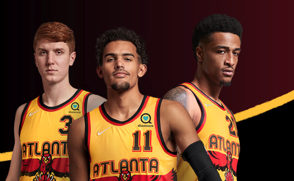
Image From Atlanta Hawks Twitter
We got a glimpse of them over the summer through rumored leaks! Finally announced for the entire Hawks fandom, the Atlanta Hawks officially unveiled their 2021-22 “City” jerseys. The new-look “City” jersey looks like it has taken bits and pieces from the Hawks past uniform history.
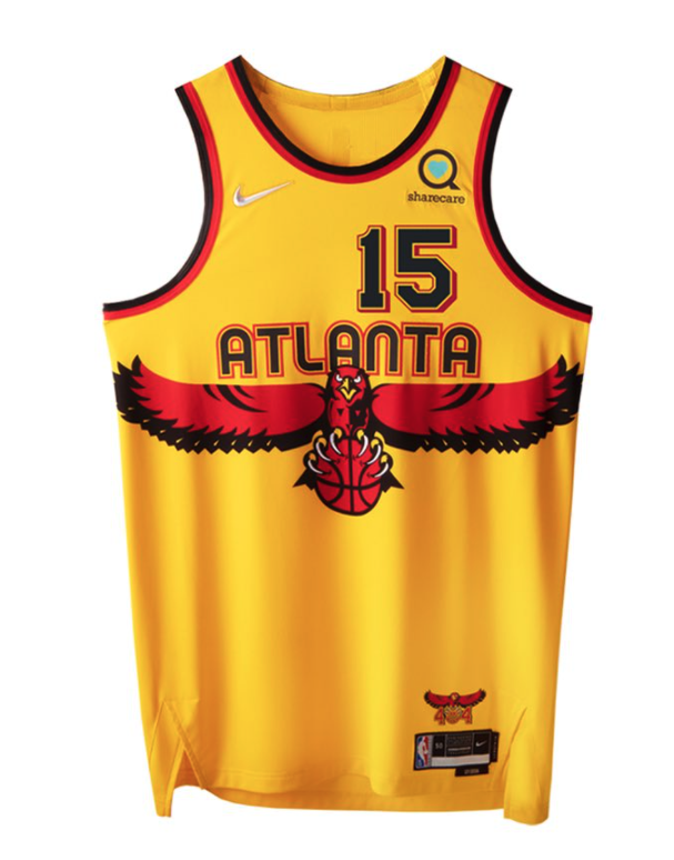
The font and writing resemble a lot like the Pete Maravich-era green/blue jerseys from the 70’s. The all yellow color of the jersey was a straight identical from the alternative jerseys the Hawks wore in the early-2000’s. Most notably, was the presence of the giant Hawk in the middle of the jersey and the number location at the top-right portion of the jersey. This is a straight copycat of the fan favorite, 1990’s uniforms, worn by players: Dikembe Mutombo, Steve Smith and Mookie Blaylock.
To be fair, it will be hard to follow up the MLK “City” jerseys from last year. They were very popular with fans, the matching court was awesome and the Hawks played very well in those uniforms, oddly enough. Hopefully, the MLK uniforms can crack the rotation and become a permanent alternative for the Hawks.
First impressions, are a thumbs up for me. I think the jerseys look sleek, and I love when they pay homage to past eras. Let us know what you think below.
